corporate identity of a printing company |
2011
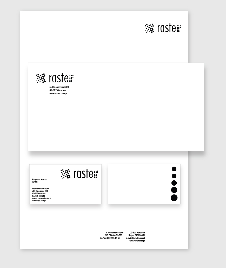
The graphic design is based on translating the company name into the nature of the logo. Its symbol is made of two r’s, which are inverted relative to each other. The basic assumption was only to use the two polar opposite colors – black and white to build a strong, contrasting design.
The branding consists of a company name, logo, business card, envelope layout and letterhead design.