brand identity for a honey company |
2012
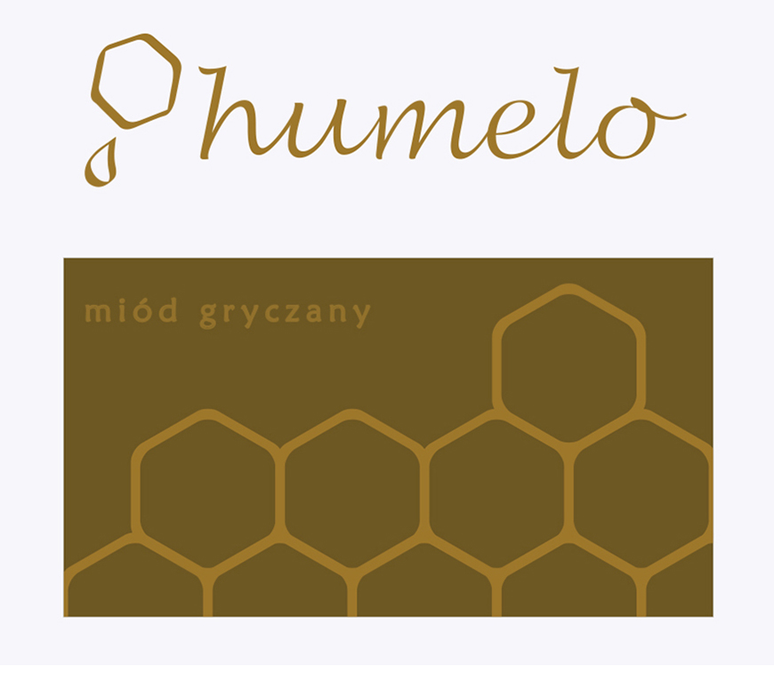
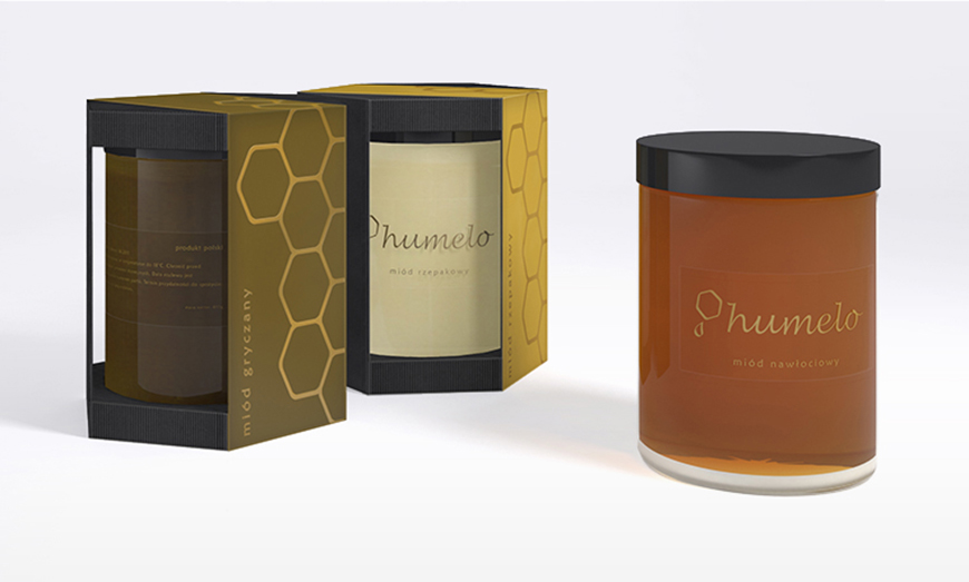
When designing a new brand I started with a catchy name with positive connotations. The graphic symbol is based on a hexagonal shape that is reminiscent of honeycomb. After redesigning, its form became more associated with this viscid, sweet fluid. As for package’s color scheme, I have decided on a combination of black and warm shades of brown. The jars with shiny black lids are elegant yet simple in their form, which allows to easily get the honey out of them.